Follow these guidelines when promoting Energi in marketing communications, including advertising, articles, websites, and printed promotions.
For full brand guidelines, please see Energi Brand Guidelines.
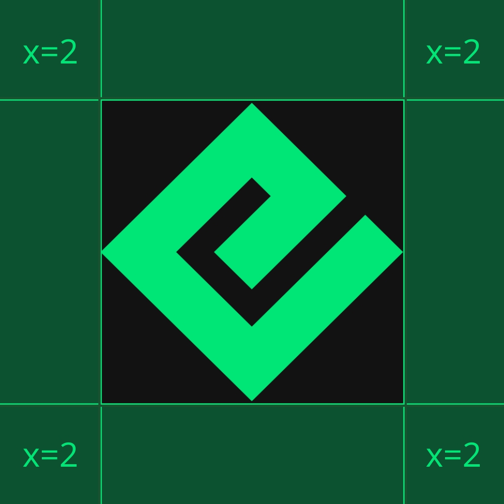
The ENERGI logo features a stylized ‘E’ formed by two offset parallelograms in a bright green hue, with three horizontal bars. Accompanying this is the name “ENERGI” in bold, uppercase letters, rendered in a modern, geometric sans-serif font.
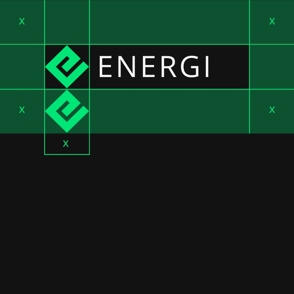
A certain amount of space is needed around the logomark to prevent it from becoming cluttered by surrounding artwork, images, or the edge of a page. Below are the minimum spacings for both logomark and wordmark.


Energi Logo Do’s


This is how it should look in PNG format


This is how it should look in PNG format


This is how it should look with white background


This is how it should look with white background
Energi Logo Don’ts


Don’t stretch the logo


Don’t use conflicting colors


Don’t change the colors


Don’t change the stylized E
Energi Primary Colors


#00E676 | RGB (0, 230, 118)


#263238 | RGB (38, 50, 56)
Energi Secondary Colors
#69F0AE | RGB (105, 240, 174)
#33EB91 | RGB (51, 235, 145)
#05CB65 | RGB (5, 203, 101)
#F4F4F6 | RGB (244, 244, 246)
#BDBDBD | RGB (189, 189, 189)
#212121 | RGB (33, 33, 33)
Energi Logo – Icon
Energi Logo – Dark
Energi logo – Light
Please direct inquiries to [email protected].
Join our Newsletter to stay in touch with the latest Energi News
We use cookies to ensure you get the best experience on our website. Learn more about the data we collect on our Privacy Policy page.